Drawing an alphabet – ‘A’
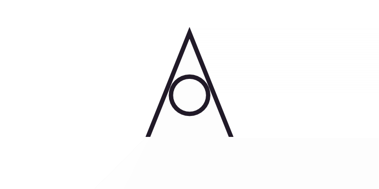
Initial idea: use a circle
I’m sure I’ve seen this done before. I did think that something similar might be part of the original alternative version of the typeface Futura. It seems not but that does use a circle as part of a lowercase ‘a’, which is what I was probably thinking of.
Simple shapes are easy to draw and understand
Many logos are based on simple geometric shapes, ones that you can easily draw with a compass and rule. It’s not surprising as simple shapes feel more powerful and clear. They’re also easy to understand and remember. You could probably tell someone how to draw this ‘A’ and they would get pretty close.
Recognition is not the same as remembering
It might seem like a good thing for a logo to be memorable in this way. But recognising a logo and remembering it well enough to recreate it are not the same. We recognise hundreds of faces but describing them is difficult. Here are many people attempting to draw some of the world’s most famous logos from memory with mixed results.
Simplicity is better than originality..?
The simpler a logo the more likely it is to look like an existing logo. All the logos based on simple shapes have been used. This doesn’t seem to stop people though, which suggests the desirability of using a simple shape is more important than being original.
Originality is overrated
The main purpose of a logo is to identify an organisation so it needs to be original, to some extent. However, there are millions of logos in the world, many of them visible on the internet in seconds. The chances of having a globally unique logo are slim.
If you’re a coffee shop wanting an original logo you’d avoid using an image of a mug or coffee bean. But will it look like the logo of a coffee shop to your potential customers? Whether it matters will depend on how you use it.1
Simple shapes are a bit boring
Are simpler geometric shapes more attractive than other shapes? A circle or square is satisfying in a way that an ellipse or oblong is not. This might be because we see them so often that they’re reassuringly familiar, not because our brains are attracted to pure geometry.
But they’re also dull. There are no surprises in a circle. We might be bored of seeing them so often. There’s not much ‘information’ in a simple shape – a square is a square – so it doesn’t interest us.
It’s unlikely, however, that a logo uses a simple shape on its own. It’s likely to be a frame or anchor for more interesting things.
This is part of a project to draw the letters of the alphabet in different styles.
Bonus feature
Letters into logos
It wasn’t the original intent but the potential was obviously there – I’ve turned some of the letters into logos and branding. I’ve had to invent companies to match the logos, which is not the usual order of things.
- A local coffee shop uses a lightbulb for its logo and has a large lightbulb-shaped sign hanging outside. Original, but the shop is on a quiet lane some yards from the main road. Passers-by looking down the lane will see a lightbulb and not a coffee cup. There are people who pass regularly who don’t know it’s there. Of course, there’s no need to make the sign the same shape as the logo.